As part of our series about giving your clients the best experience with a WordPress powered CMS, we thought we would share how we present our websites to our clients. Throughout this article we offer you our tips on how to improve your processes and advice based on our experience.
Our main aim initially was to provide WordPress instructions for clients by providing a great experience for our clients using their WordPress CMS. We realised that first impressions really count. So this is what our current site deployments have a heavily customised dashboard which looks like:
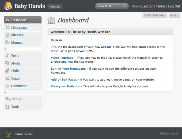
We hope you have noticed the following things about this dashboard:
- We customise the header and footer logo
- We remove all the panels from the dashboard and add in our own welcome panel which is personalised for the client
- The welcome panel contains links to the important areas in the CMS
- We have a clear link to edit the homepage
- We have a clear link to the page manager (sitemap)
- We have a complete video tutorial suite accessible where the client needs it most (in the actual CMS)
- We give our clients Editor only access
As a small business owner you should be looking to develop processes which are easy to replicate, save you time and money. This dashboard has evolved because we were constantly looking to improve on our process. We will outline ways for you to improve your processes below.
Custom Logos
Which feels more personalised?
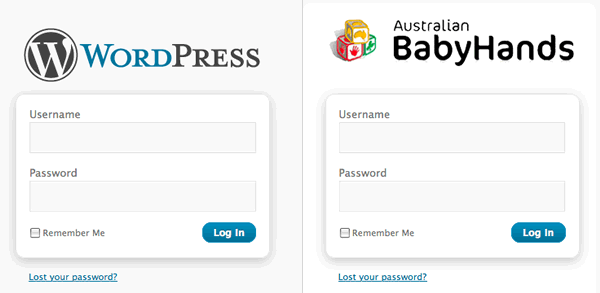
Now there are lots of plugins out there which will allow you to do this, but we were looking for something that was very simple. Every plugin out there gave us more functionality than we actually needed. We did not need to waste time changing anchor colours, or background colours, the current WordPress colour scheme is excellent. So we built our own plugin (the White Label CMS plugin).
We always modify the login and header logo to be the clients logo. We also felt it was necessary from our own branding point of view to place our logo in the footer of the CMS, and also provide a link to our website, just as way of making sure the client would not forget us for any future projects they might have.
We wanted to make sure that during the design process, we could create a logo for the login and a logo for the header, place them into the images directory of the active theme, and then not have to think about it.
Process: Always upload a custom login, custom header logo, and your company logo to the active theme. Then install the White Label CMS plugin
Removing All Panels From The Dashboard
For us, the lack of documentation and the cluttered dashboard was always the achilles heel of WordPress as a CMS. It felt wrong to keep telling clients to ignore the dashboard. A partial solution is provided by WordPress itself. You can simply remove the panels from the dashboard using the Screen Options tab:
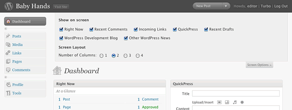
However removing all the panels was only marginally better than having all of them there. What we needed was our own custom panel on the dashboard to personally welcome the clients to their CMS. Again, we looked around for a plugin to do this, but in the end decided to incorporate it into our White Label CMS plugin.
Most of our builds are actually websites rather than blogs, so we prefer to remove all dashboard panels. However if your client does have a blog attached to their site, then you may consider it necessary to leave some panels on. We have found from our own experience that the clients are really only interested in any comments left on their blog posts, and that is clearly visible on left navigation.
The welcome panel we use also has a link to the clients google analytics account, giving them a better experience by having everything in the one place.
Process: Remove all panels from the dashboard and insert your own welcome panel.
Process: Have a generic text file where you store the text for your welcome panel, so it is a simple copy and paste and adding the clients name if appropriate.
Group All Main Menu Sections Below The Dashboard
When we first started to develop our own plugins, they would all sit at the bottom of the menu system. Telling the client to always use the links at the bottom of the menu felt counter intuitive. Normally the most important links are at the top!
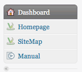
For each site we usually have 3 main menus for:
- Editing the homepage
- Editing the site structure
- Viewing the video tutorials
The client can usually run their CMS through those 3 links. It makes sense for us to group them together at the top, and we have had nothing but positive feedback from our clients ever since.
We will go into more detail about how to do this in a future article. There are some technical reasons why you should not do this, the main one being that if WordPress updates, you may overwrite one of the existing sections. However we are comfortable doing this, and we think it provides our clients the best experience.
Process: Find your own way of standardising your WordPress iinstallations (ie. making plugins that you control) and make it easily reproducible.
Have A Clear Link To Edit The Homepage
We have developed this solution over a long period of time and we are sure it will continue to evolve. Most solutions out there are based on having excerpts from existing posts or pages inserted into the homepage, however in a lot of cases, there are extra pieces of information you want to add which are specific to the homepage which don’t fit with in a post or page. If the client wanted to update their homepage it meant doing it in different places, confusion usually reigned.
Our solution was to develop a page which handles all elements of the homepage. If you want to do this yourself, there is a brilliant article here which explains how to set up a options page in WordPress. We just adapted this ourselves.
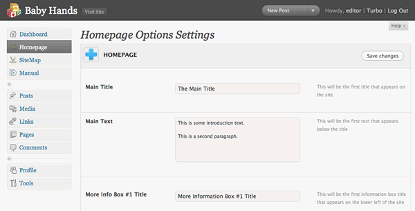
We feel that the most important thing about this page is that is easily customisable. Each website requires something slightly different, but we can simply add a couple more lines to the setup array, and it will appear in the homepage options menu. So adapting this for each client takes seconds rather than hours like it used to.
By providing an options page you give the client the ability to change the homepage, but at the same time you restrict what they can actually change as well. We have used drag and drop solutions in the past for all clients to modify the homepage, but 90% of them never used them, and the 10% that did, usually ended up calling us because it did not behave the way they expected.
Process: Create your own flexible solution for the homepage which future projects can use.
Advice: Don’t be afraid to say no to clients when they ask for extra functionality. Sometime it is better (cheaper) for everyone if the developer comes in and makes the requested change, rather than building in the functionality to make it possible … if it is ever requested.
Have A Clear Link To The Page Manager
Finally, with the coming of WordPress 3, developers will have a built in solution for this, so we will not go into much detail about it right now. We are sure that like us, you have tested every plugin available, and in the end chosen a hybrid of the best ones. We use a variation of PageMash, with a few modifications we felt were necessary, like being able to have short menu titles, and choose how the left navigation was outputted.
Process: Choose a page manager, preferably one that is established, and make it part of your installation process and stick with it. This way you know your video tutorials will always be valid for the next client.
Have A Clear Link To The Video Tutorials
Tutorials are essential if you want to have a professional handover to your client, and will save you time and therefore money. If you look around this website, you will see lots of information about the video tutorials plugin we provide. We are sure you have gone through a similar process of constantly producing custom tutorials for clients and underestimating how long this all takes. Also, WordPress 3 is coming, so you are going to have to remake them all anyway! The sales pitch ends here!
Process: Create generic tutorials for you WordPress CMS that incorporate the main functionality of the site and can be reused for future clients.
Advice: Create a simple subdomain where you can make you generic videos, and which is permanent, so you can create new videos in the future with the same look and feel.
Advice: Don’t use Jing for your tutorials. That 5 minute time limit forces you to rush, and it will not sound professional.
This is an example of how use our Video User Manuals plugin. In a future post we will explain how to get the most out of the plugin:
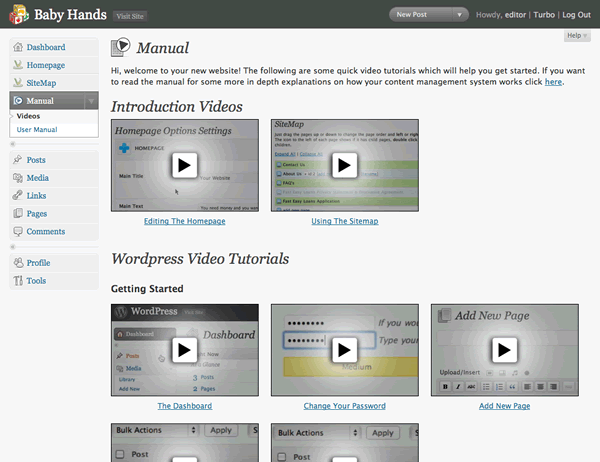
There are a couple of important things to note:
- The client has a comprehensive video and written manual accessible from the dashboard
- We have created 2 generic videos which cover how to use the homepage and the sitemap which are specific to the way we build websites.
- We have adapted the plugin so it contains these videos in the config file, so no modifications are needed to the plugin, it is just a case of installing it, and everything will appear correctly. This saves valuable time.
Give Clients Editors Access Only
The vast majority of our clients are not specialists in IT, and are really only interested in having a website that looks great, and so presents a good image of the company. They don’t care if their plugins are up to date, or the fact they can have links in their blog roll.
The less unnecessary options available to the client, the less opportunities for confusion. This is why we usually give our clients just the Editors login, not the Admin login.
How Do You Do It?
So we have shown you the way we hand over our websites to our clients, and in the future articles in this series we will go into more depth about the some of the points made here, but for now we would love to hear how you hand over your sites to your clients.


Nicely authored and articulated.
I am just finishing off a 30 page website manual in PDF format, which is how I usually finish up most web projects. Creating these PDF’s can be very time consuming and (as a designer) tedious. I have thought about creating video tutorials, your post has helped cement why it is such a great idea to offer such a service. It looks professional and breaks everything down into manageable chunks. I am yet to venture into the world of custom WordPress Plugins, but I think it’s becoming a necessity. Can I ask how long it took you to begin developing your own Plugins?
Thanks for Sharing.
Hey Matt,
Developing your own plugins is an ongoing process of learning and testing and getting feedback. You might want to start with WP Plugin Development for Beginners by Vladimir Prelovac. (Google it).
How did you go providing your clients with videos and training PDF?
Cheers,
Troy.
Thanks a lot for sharing this invaluable ideas for helping clients finding their way around the WordPress installation.
Keep up the great work.